
Why Last Click Misleads: How to Read Full-Journey Conversion Paths and Touchpoints
Conversion path analysis shows how channels and campaigns work together across touchpoints. Learn how to interpret paths, time to conversion, touch points count, AOV, and Sankey flows for better budget decisions.
TL;DR
- Conversion path analysis explains how channels and campaigns work together across multiple touchpoints.
- Last click can describe closers, but it often under-values earlier touchpoints that create demand.
- Use path tables and Sankey flows to spot repeated sequences, then validate with conversion value, AOV, time to conversion, and touch points count.
- Keep the attribution model consistent for comparison, and switch models when you want to stress-test a decision.
Last click is comforting because it is simple. It is also dangerous, because it turns a customer journey into a single moment and makes every upstream touchpoint look optional.
Conversion path analysis is a way to see what actually happened before a conversion. Instead of asking “Which channel got the last click?”, it asks “Which sequence of touchpoints tends to lead to conversions, and how long does it take?”
This is not theory. It is the difference between cutting prospecting too early and scaling what truly creates demand.
Why conversion paths matter for budget decisions
When teams rely on last click, they tend to:
- overfund closers, like branded search and retargeting
- underfund introducers, like discovery ads and content
- interpret “assists” as waste, instead of as the cost of creating high-intent demand
Conversion path analysis makes the hidden work visible. It shows how channels and campaigns combine, and it lets you compare paths by conversions, conversion value, average order value, time to conversion, and touch points count.
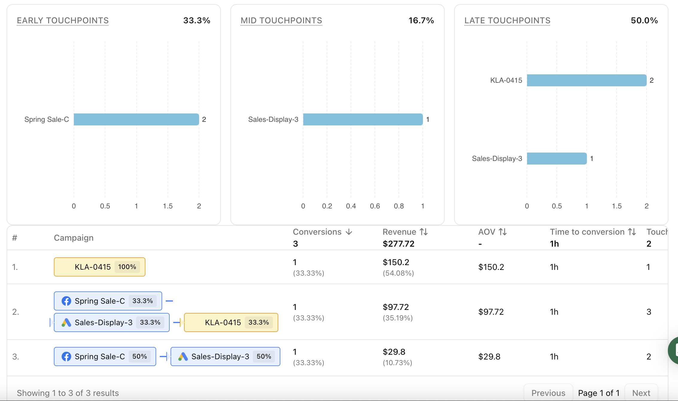
The conversion path table and the questions it answers
A conversion path table groups journeys into repeated patterns.
Think of each row as an answer to a question like:
- What sequence of channels tends to produce the most conversions?
- Which paths produce the highest conversion value?
- Which paths lead to higher average order value?
- How long does it take for a path to convert?
- Do customers convert after one touchpoint, or after multiple touchpoints?
Path
The path is the ordered sequence of touchpoints that occurred before conversion. Depending on your dimension, the touchpoints may be channels or campaigns.
Conversions and conversion value
Conversions tells you volume. Conversion value tells you impact. They often point to different priorities:
- a path with high conversions may be great for scale
- a path with high conversion value but lower volume may be great for profitability or premium offers
Average order value
Average order value is a strong lens for customer intent. If a path consistently produces higher AOV, it may be attracting a different customer segment, even if conversion count is smaller.
Time to conversion
Time to conversion is the patience metric. It helps you avoid penalizing paths that take longer because they are doing early-stage persuasion.
If your time to conversion increases, that can mean:
- you are reaching colder audiences
- your offer requires more consideration
- your landing page or checkout has added friction
Touch points count
Touch points count tells you how complex your journeys are.
- shorter paths often indicate strong intent or strong brand pull
- longer paths often indicate consideration, comparison, and repeated exposure
Neither is “better” by default. The key is whether the touchpoint sequence is efficient for the goal you are optimizing.
Read conversion paths by channel, then zoom into campaigns
Conversion path analysis becomes actionable when you move from general patterns to specific levers.
Channel view
Channel view helps you understand the structural roles in your customer journey. For example, you may learn that:
- paid social is frequently an early touchpoint
- email is often a mid touchpoint that brings users back
- search or retargeting is often a late touchpoint that closes
This is not about giving “credit.” It is about understanding the system you are operating.
Campaign view
Campaign view helps you translate the pattern into decisions:
- which campaigns consistently show up early in high-value paths
- which campaigns repeatedly appear as the last touchpoint in high-volume paths
- which combinations create the best outcomes
The most useful question here is not “Which campaign won?” It is “Which campaign pairs well with which, and what does that imply for budget and creative?”
Why Sankey diagrams make paths easier to see
A Sankey diagram turns path data into flow. Nodes represent channels or campaigns. Edges represent the movement from one touchpoint to the next, and thickness represents conversion volume.
Sankey is especially useful for:
- spotting the most common journey “backbone”
- finding where journeys split into different outcomes
- identifying which touchpoints frequently lead into high-performing closers
Use Sankey to see the structure. Then go back to the path table to confirm with metrics like conversion value, AOV, and time to conversion.
Attribution model choices change how you interpret paths
Multi-touch attribution is not a single truth. Different attribution model choices shift how value is allocated across touchpoints.
The practical takeaway is simple:
- keep the attribution model consistent when comparing paths
- change the model when you want to stress-test a decision
If a channel looks strong only under last click, it may be a closer that depends on upstream demand. If it looks strong under broader models, it may be contributing earlier than you think.
Where Attribuly fits in
Attribuly’s Conversion Path reporting supports table and Sankey views and lets you analyze paths by channel or campaign. You can filter by date range, conversion goal, and attribution model, then open a path to review the underlying conversion list and values. This keeps journey diagnosis and decision-making in one place.
FAQs
Is last click always wrong?
What is a good touch points count?
Why does time to conversion matter?
About Attribuly
Attribuly helps DTC brands recover abandoned cart revenue. We identify anonymous visitors and existing subscribers your ESP (like Klaviyo) missed, enrich their profiles, and feed the signals back — so your abandonment flows fire and your retargeting audiences grow, and you recover at least 15% more revenue. Shopify featured app, Klaviyo tech partner. Trusted by 20,000+ brands. Guaranteed 4× ROI.